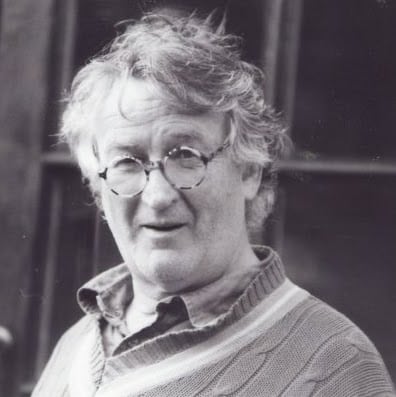
James Rosenquist with his mother and an early creation from his days painting billboards in Minnesota, 1954.
[dropcap style=”font-size:100px;color:#992211;]T[/dropcap]his exhibition focuses upon the decade in which James ‘Jim’ Rosenquist established himself in New York as a serious painter. He was educated at the University of Minnesota, 1952-4; and then at the Art Students League, New York, 1955-6, on an ‘out-of-town scholarship’. Whilst studying at ASL, he frequented the cheap and cheerful Cedar Tavern, home to the predominant Abstract Expressionists, where he drank with Willem de Kooning, Franz Kline and Milton Resnik; along with a younger coterie of up and coming ‘New Realists’.
Billboards
In the late fifties he worked as a painter of monumental billboards and theatre signs, leading teams of commercial artists in the advertising sector. Whilst at the Art Students’ League he painted commercially in New York for the Artkraft Strauss Sign Corporation, where he learned “what it was like to paint Davy Crockett’s fur hat, Schenley Whiskey bottles, and the lettering for Hebrew National salami … Up on the scaffolding, he had a perfect view of America.” (Artsy)
Coenties Slip
In 1960 he gave up working as a Commercial artist and set up studio in Coenties Slip, overlooking the East River. Fellow artists at the studios included, Jasper Johns and Ellsworth Kelly. Rosenquist’s studio was previously inhabited by Agnes Martin; and so, from the conservative disciplines of draftmanship and composition he had absorbed at Minnesota and the ASL, he became familiarised with the avant-garde tendencies of the Black Mountain College, through Johns and Robert Rauschenberg, who had a studio nearby.
According to Holland Cotter in the New York Times, 5 January 1993, the Coenties Slip group, which included,
“James Rosenquist, Robert Indiana, Jack Youngerman, Lenore Tawney, Fred Mitchell, Charles Hinman and Ann Wilson — never constituted an art movement.
What really bound them together was how and where they lived. They were the first community of New York artists to live in industrial spaces. The lofts, though spartan, were cheap. (An average rent was $50 a month.) Few had kitchens or hot water, and there were constant threats of eviction. The rewards, however, were great: silence at night, abundant light during the day, unobstructed views of the East River and the Brooklyn Bridge, and a pervasive sense of place and history.”
Ellsworth Kelly, who had spent six years in Paris on the GI Bill, had intended to go to Black Mountain College, having heard of it through his friend Rauschenberg, but never got there. Nevertheless, both he and Martin pursued abstraction, influenced by Ad Reinhardt’s painting. The abstract expressionists were in decline. Clement Greenberg’s insistence on the flatness of the canvas was giving way to a more austere abstraction on the one hand, and to more depictive practices on the other. Abstract expressionism, that is to say, was threatened by minimalism, arguably the logical conclusion of Greenberg’s formalism, and by ‘New Realism,’ soon to be renamed ‘Pop’ by Lawrence Alloway.
What do art historians do?
“Rosenquist’s day job painting billboards led to his greatest work,” writes Julia Fiore in her article in Artsy
Art History, whilst noble, remains precarious. Its practitioners have to sort out the mess that artists make. There are two inter-related strategies that historians rely upon. One is to bring together into coherent collation or movement, works of art or groups of artists. When this is well done, the works of art and the artists who made them become identified with an art style. The other strategy feeds off this first. Its aim is to (secondarily) determine what constitutes the work of any one of the group members as his or her definitive contribution to the group. Each of these strategies is stylistic. The first identifies art historical style; the second, individual style.
“In The Principles of Art History … the Swiss art historian Heinrich Wölfflin talks of the “double” or “twofold, root of style.” Whether we accept or reject the particular way in which Wölfflin makes the cut, we should be grateful for the reminder that, in our thinking about and talking of art, the concept of style turns up twice. Sometimes we think and talk about general style: sometimes we think and talk about individual style.” (Wollheim 1993 171)
So, for instance, Picasso worked in many general styles (including neo-classicism, surrealism, cubism, and post cubism). He also developed a style all his own. And so: work across the different art historical styles can be identified as work in his unique and unified individual style.
Eruptions in contemporary art can cause a review of art historical style. We look again at the coherence of an established art historical style in order to accommodate some new work or to better get a grasp on what had hitherto escaped our attention. (I leave it moot as to whether an artist’s individual style is susceptible to vicissitudes of such revisionist turbulence.)
Collecting together new realists or pop artists might be done by considering their backgrounds in commercial art.
“By 1964, Pop art had swept the art world. Jim Dine, Roy Lichtenstein, Claes Oldenburg, Tom Wesselmann, Andy Warhol and Rosenquist were key artists within this new ‘movement.’ Each artist had a distinct style, yet there were commonalities that defined Pop art in the early 1960s: the depiction of everyday, popular objects and the use of commercial techniques.” (Bancroft 2015)
Scale
Whilst many in the new movement had backgrounds in commercial art and in its various techniques, scale was essential to Rosenquist’s formation as a painter. Hand-held compositions were scaled up whilst the painter stood on scaffolding so that enormous billboards – Rosenquist recollected that the shared billboard for the Astor and Victoria theatres in New York measured 395 feet long by 58 feet tall – were painted by squaring up the small image and painting the large squares of the billboard accordingly. The painter never got to see his work as he was doing it. And so, for Rosenquist, he was only ever aware of the abstract nature of the image ‘close up.’
As Sarah C. Bancroft, Executive Director of the James Rosenquist Foundation, puts it neatly,
“When seen from the street, the image of a product or an actor’s face – Marlon Brando in the movie The Fugitive Kind, a bottle of Schenley whiskey, an Oscar Mayer sausage, or an Arrow dress shirt, for instance – popped into resolution.” (Bancroft 2015)
In his interesting chapter, ‘Paths of Experiment: Reduction,’ Stephen Bann’s perspicuous observations return us to the questions of depiction that might have been thought abandoned by pop art. After all, the movement started out as ‘New Realism.’ Bann, in this chapter, however, argues for the experimental nature of Johns, Rosenquist and Rauschenberg; and in particular to their treatment of representation within the history of art. (Bann 1970)
Johns painted numbers, letters, maps and flags: flat things. Back in the 1950s British children would take to the street with small union flags created in their art class, waving them at the Queen as she was driven past in her motorcade. There seems to be no answer as to whether they were drawing flags (in an act of representation) or making flags (anew; and so not representing at all). Johns presents us with exactly this ‘zero’ approach to representations that have no depth.
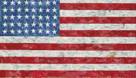
Jasper Johns, Flag,, 1954-55, encaustic, oil and collage mounted on plywood, three panels, (MoMA)
Rosenquist rejects the view that his paintings were narrative:
“I’m interested in contemporary vision,” Rosenquist once said, “the flicker of chrome, reflections, rapid associations, quick flashes of light. Bing-bang! I don’t do anecdotes.” (Bancroft 2015)
Bann looks back to Duchamp’s Bride Stripped Bare of Her Bachelors Even (The Large Glass); and writes,
“[T]he elements of which it consists are trapped between two surfaces of glass. They may, like the exquisite water wheel, offer an illusion of perspectival space. But this is cancelled almost immediately by the fact that we are aware of the exact thickness of the transparent picture plane. Duchamp emphasizes the highly precarious quality of the plane surface once the apparently limitless density of the canvas is replaced by a medium that is transparent.” (Bann 1970 116)
Marcel Duchamp, Bride Stripped Bare By Her Bachelors, Even (The Large Glass) (detail) 1915-23
Thus, for Bann, there is a negation of pictorial space achieved by replacing canvas by glass and trapping the ‘image’ between two sheets. Although Bann uses this argument to explain the ‘degree zero’ of depiction in Johns, – where object depicted just is the picture itself – it is also instructive in looking at Rosenquist.
Bann, in discussing Rosenquist, remarks upon the flatness of the photograph, so that it, like Johns’ numbers, letters and maps, is recognized as a flat thing.
Rosenquist achieves flatness, in part, by using mixed scale in combinatory images; and by using the photographic sources as indicating the flatness of the picture fragments we look at. Rosenquist, that is, paints pictures of photographic montages: pictures of flat things.
“By cunningly working up, and at the same time undermining, a photographic surface, Rosenquist is attacking one of our most entrenched visual conventions, and so making a point which can radically affect our relationship to the pictorial world.” (Bann 1970 122)
and adds,
“[T]here is the complete rejection of the conventional props of painting (‘that old pictorial space’). This gives rise to the firm conviction that the ‘beyond’ in painting is not to be regarded as inhabitable space, but as emptiness. Yet the sensation of emptiness cannot be evoked by the superficial expedient of the empty canvas. In order to convey uninhabited space, Rosenquist must elaborate on the surface of the painting an illusory scheme just as complicated as was necessary to evoke inhabited space. He must devise a pattern which will veer between operating as a photographic image and revealing itself as ‘unnecessary stuff on the surface’. As in the case of Jasper Johns, the destiny of the work is to achieve an ultimate vacuity which indicates that no assumptions have been allowed to stand. Rosenquist recalls Johns in making a close conjunction between the picture and the ’empty wall space’.” (my emphasis) (Bann 1970 122)
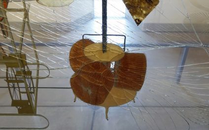
We have already noted Bann recruiting Duchamp’s Bride to the task of rejecting or nullifying perspective by trapping the images between two sheets of glass. Those comments are particularly apposite to Rosenquist’s Mylar paintings, one of which, Forest Ranger, 1967, occupies the first floor Chapel Gallery in this show and is the first time it has been exhibited in the UK.
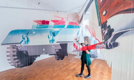
James Rosenquist, Forest Ranger, 1967, paint on industrial Mylar
What do curators do?
Curation has become a creative discipline within the arts. Universities now offer, within their fine arts provision, graduate courses in the art of curation. The creative aspect of curation looks at what the juxtaposition of works of art from across a wider spectrum than that confined by art historical style. Curation can reveal otherwise ‘unseen’ connections between works of art from different art historical periods and across different movements.
Two exhibitions in 1963 provided exposure to Pop as a new movement. The first, ‘New Painting of Common Objects,’ in Pasadena and curated by Walter Hopps, inspired a second at the Guggenheim, ‘Six Painters and the Object’, curated by Lawrence Alloway.
Hopps curation of the first show brought together Roy Lichtenstein, Jim Dine, Andy Warhol, Phillip Hefferton, Robert Dowd, Ed Ruscha, Joe Goode and Wayne Thiebaud.
The six artists who were highlighted in the second exhibition include: Robert Rauschenberg, Jim Dine, Jasper Johns, Roy Lichtenstein, James Rosenquist, and Andy Warhol. In his catalogue essay, curator Lawrence Alloway underscores a shared similarity between the artists to be found in “the common use of objects drawn from communications network and the physical environment of the city.”
Walter Hopps
I mention Hopps because he is a curator with an eye for breadth. He is associated with Rosenquist, but also with other artists who would only peripherally be connected with Pop. Marcel Duchamp, Joseph Cornell and Ed Kienholz amongst them. We have already noted Bann’s connection between Duchamp and Johns; and its extension to Rosenquist. Thinking of Hopps and the artists he supported and encouraged, one might wonder how he might reconcile Rosenquist, Cornell and Kienholz.
Imagine that Hopps had curated a show of work by Rosenquist, Kienholz and Cornell. What might such a compilation of works reveal?
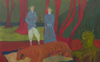
Emptiness: Rosenquist and Kienholz (and Tom Waits)
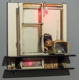
Edward and Nancy Kienholz, Drawing for Hoerengracht, 1987
Rosenquist and Kiemholz both attend to emptiness. Perhaps their ‘Americana’ is a common theme. They both exploit the new media, television, film, advertising and other aspects of what would later be referred to as ‘the image stream’. And once collaged together with images that bear no relation to each other, the emptiness shows up – rather as Tom Waits’ ‘Step Right Up’ avows in his own version of Americana. Waits keeps shovelling it in; and the more he shovels it in the emptier the lyric gets. Waits, I would contend, is a fine image of what the connection of emptiness is between Kienholz and Rosenquist.
Flatness: Rosenquist and Cornell
Rosenquist’s paintings are also notable for their flatness. Earlier I added the painting of photographs or photographic elements to the flatness of flags, numbers, letters and maps that Johns was noted for. But the flatness of photographic images are images witha ‘beyond’. I wonder if Bann’s claim, quoted earlier, that, “Rosenquist must elaborate on the surface of the painting an illusory scheme just as complicated as was necessary to evoke inhabited space,” commits him to representation as illusionistic. If so, it is a discrepency between his and my thinking on representation. I follow Wittgenstein and Sartre in thinking that seeing representations is non-illusionistic. We literally see the painted surface but we only figuratively see the painted surface as having content. The first (literal) seeing is perceptual, the second (figurative) seeing is imaginative. As philosopher Brian O’Shaughnessy has put it more recently,
“[Seeing pictures] consists in seeing expanses of colour in such a way that, while remaining expanses of colour for one, they simultaneously in a special imaginative sense bring a landscape into view. For there are not two phenomena here: seeing coloured expanses on a piece of cardboard and seeing a landscape in a photograph. There is one complex phenomenon with two internal objects: namely, coloured expanses and landscape – the latter being second-order to the former. This complex phenomenon is therefore of the type, seeing, and not of the type, imagining. And that is why I describe it as imaginative seeing rather than as visual imagining.” (O’Shaughnessy 2000 347)
How then does our purported exhibition bring out the flatness of Rosenquist’s painting? It is here that we look to Cornell. Hopps was instrumental in the organisation of ‘Joseph Cornell/Marcel Duchamp … in resonance,’ an exhibition at the Philadelphia Museum of Art in 1998. It was Hopps who discovered Duchamp Dossier in Cornell’s house upon his death. The two artists, Cornell and Duchamp, had worked and shown together. But Cornell is not Duchamp. The latter had always wanted ‘an art of the head,’ having had enough ‘art of the hand’. Cornell, by contrast, is more innocent.
If we think of Cornell’s work, the small boxes and the neat, page-sized collages, we could think of them hanging together with Rosenquist’s works on paper. In the ground floor corridor of 37 Dover Street, there hang many of what Rosenquist referred to as Sources or as Preparatoty Studies. These are beautiful, delicate, ‘hold-in-the-palm-of-your-hand,’ objects and they are anything but flat. Cornell, by contrast, and in particular with regard to the boxes, are frontal; and are to be seen as paintings rather than sculptures. Nevertheless, both Cornell’s and Rosenquist’s small works are very much objects rather than mere images. It is in comparison with the scaled up paintings for which these Sources and Preparatory Studies are generators that we see the full blown works as flat images – almost as if they are projected images with no thickness at all.
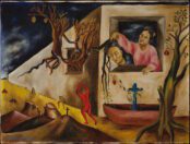
In addition, in a number of works Rosenquist adds three-dimensional objects. This actual three-dimensionality underscores the flatness of the paintings themselves. See, for instance, Morning Sun, from 1963.
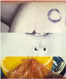
James Rosenquist, Morning Sun, 1963
Of Rosenquist’s handling of scale. Bancroft writes, “Works on paper – whether preparatory drawings, collages, or limited edition prints and multiples – have continued to be an important part of Rosenquist’s practice to the present day. Artworks in their own right, these compositions reveal the artist’s interest and working practice in all media.” (Bancroft 2015)
The small collages are little jewels and look immediately as if they would belong with Cornell’s collages and small assemblages. Being so small and having the material presence of different papers and printing styles, other marks, masking tape and other fabrication indices that would have you handle them with kid gloves.
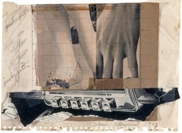
James Rosenquist, Source for Pushbutton, 1961
Rosenquist’s large works are ‘immersive’. In that they echo the tableaux of Ed Kienholz, whose use of collage, paint and texture in his sculptures has much in common with the ‘seeing’ encountered in Rosequist’s Mylar works.
It would be stretching a point to include either Cornell or Kienholz in the company of Rosenquist and the Pop artists; but something might be sensed in comparing these artists one with another.
The exhibition is at Galerie Thaddaeus Ropac
37 Dover Street W1S 4NJT
Opening hours, Tuesday – Saturday 10am – 6pm
The exhibition runs from 10 September 2019 – 9 November 2019
References:
Bancroft S. C., (2015) James Rosenquist: Illustrious Works on Paper, Illuminating Paintings, Oklahoma State University Museum of Art exhibition catalogue.
Bann S., (1970), Experimental Painting: construction, abstraction, destruction, reduction, London: Studio Vista
O’Shaughnessy B., (2000) Consciousness and the World, Oxford University Press
Wollheim R., (1993), ‘Pictorial Style: Two Views’ in his, The Mind and Its Depths, Harvard University Press
Ed studied painting at the Slade School of Fine Art and later wrote his PhD in Philosophy at UCL. He has written extensively on the visual arts and is presently writing a book on everyday aesthetics. He is an elected member of the International Association of Art Critics (AICA). He taught at University of Westminster and at University of Kent and he continues to make art.


_web-174x126.jpg?lossy=1&strip=0&webp=1)