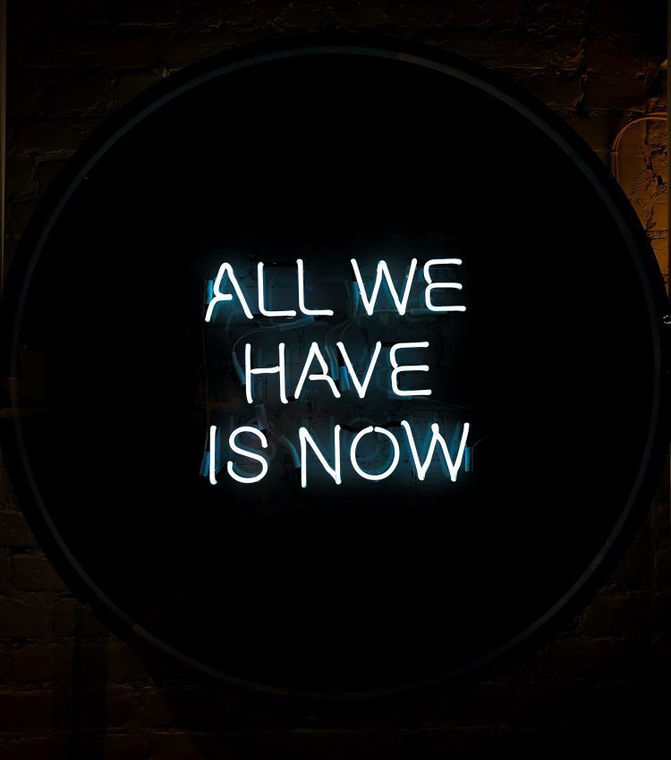
Can words be understood as objects? And what happens to their meaning when they appear within, alongside or on top of an image, colour, landscape or space? As humans we communicate our thoughts and observations through spoken language, and our words, terms and phrases give shape to the world whilst also categorising and containing it. We share words, find some agreement on mutual meanings, but we also translate and redefine them, continuously, through the filter of our individual life experience. That is to say, language is “a body, a living creature” (John Berger, 2016), unpredictable, unruly and far from stable. But what, then, about the visual representation of words?
American artist Ed Ruscha has – directly or indirectly – been exploring these questions for almost six decades. He rose to prominence in the late 1950s when he began making collages, appropriating images and words taken from everyday sources such as magazines and advertisements. In the 1970s his work started to incorporate longer phrases and sentences (seemingly) randomly plucked from the clamour of American life – billboards, cinema, overheard conversations, common colloquialisms and the sounds of the city. These textual fragments, which often recur across multiple pieces or series, were and still are mainly rendered in a simple, hard-edged font such as Boy Scout Utility Modern (Ruscha’s own creation). The words and phrases appear suspended against a single wash of colour or a seductive blend of watery hues, sometimes behind a thin fog or floating away into the distance; they appear in different sizes, at varying angles, sculptural or flat, overlaid onto picturesque mountainscapes or the luminous light shadows of a window and, occasionally, caught like startled animals in the glare of headlights. The actual application of the words on canvas comes about “through tricks and devices and stencils and block-outs and stuff like that” (Ruscha 2016) – the key phrase here being “tricks and devices” as Ruscha’s works are deceptively simple, favouring a clean, crisp aesthetic that consciously hides the artistic processes from the viewer so as to achieve the look of a “perfect” image.
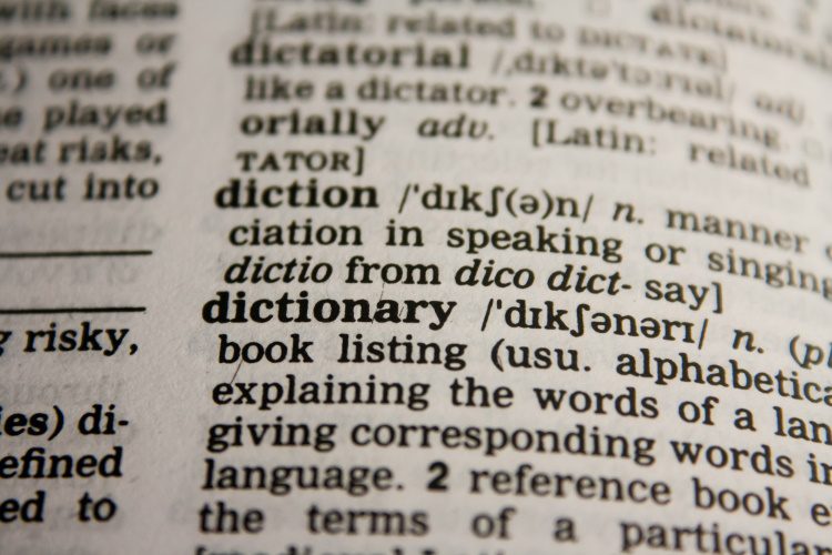
As such, Ruscha’s text-based works are often associated with the techniques and aesthetics of both Pop Art – the likes of Jasper Johns (a major influence on Ruscha) also used stenciled text in pursuit of a kind of standardisation – and to a lesser degree, advertising. However, while pop artists generally used words as interchangeable, “transparent signs of something else” (Lisa Pasquariello 2005) and advertising employs language as a tool of persuasion or coercion, Ruscha’s relationship to, and use of text is both more nuanced and ambiguous. In fact, the ambiguity and deadpan quality of Ruscha’s words is such that it’s often mistaken as “a kind of cool indifference towards his viewer” (Ken D. Allen 2010). The assumption is strengthened by the the artist’s continued guardedness about his choice of words or their meaning – “whether or not the work communicates anything to anyone is not important to me” (Ruscha 1985) – but this interpretation centres around the idea that text must not only communicate something concrete, but also build some kind of connection between artist and viewer in the process. What’s interesting is that this is not something that we typically demand of purely pictorial art; generally, we understand art to be a subjective experience that we may or may not connect with or relate to, but the additional element of language is problematic because it is both definitive and ambiguous, collective and personal. Perhaps then, Ruscha’s materialisation of words, that are detached from individuals or precisely defined contexts, is, in fact, a way of negotiating this problem, of making the inherent tensions of language visible. That’s not to say that Ruscha’s words are somehow neutralised through visual representation (this would be impossible), but by evading both overt discussion of linguistic meaning and the creation of pictorial explanations or associations, he allows for a more subjective and embodied experience of language. In his work, we encounter and relate to words as if they were physical objects that we could hold, measure and weigh, but at the same time, we read and understand them as conveyors of meaning….
Referencs:
Aarons, Philip E., Roth, Andrew., and Lehman, Claire. (eds.). 2017. Artists Who Make Books, Phaidon
Allan, Ken D. “Ed Ruscha, Pop Art, and Spectatorship in 1960s Los Angeles.” The Art Bulletin, vol. 92, no. 3, 2010, pp. 231–249. JSTOR, www.jstor.org/stable/29546123. Accessed 14 June 2021.
Berger, John. 2016. Confabulations. London: Penguin.
Kuspit, Donald. 1991. ‘Signs in Suspense: Ed Ruscha’s Liquidation of Meaning’. Arts 65 (April): 91.
MoMA, “Word Play”, 2021 https://www.moma.org/learn/moma_learning/themes/dada/word-play/ (accessed 15 June 2021).
Pasquariello, Lisa. 2005. ‘Ed Ruscha and the Language That He Used’. October 111: 81–106. www.jstor.org/stable/3397674 (accessed 9 June 2021).
Ruscha, E (1988) in Fred Fehlau, “Ed Ruscha,” Flash Art, no. 138 (January–February 1988)
Ruscha, Ed (1985). ‘Premeditated: An Interview with Ed Ruscha’. Interviewed by Jana Sterbak. In Leave Any Information at the Signal: Writings, Interviews, Bits, Pages, edited by Alexandra Schwartz. 281-85. Cambridge, MA: MIT Press. Pp.
Ruscha, Ed. 1973., ‘Words With Ruscha’. Interviewed by Howardena Pindell. In Print Collector’s Newsletter 3, no. 6 (January–February).
Turvey, Lisa. ‘“Things Fall Apart”: Ed Ruscha’s Swiped Words’ Gagosian Quarterly (4 September 2020. gagosian.com/quarterly/2020/09/04/essay-things-fall-apart-ed-ruscha-swiped-words/. Accessed 9 June 2021.

Millie Walton is a London-based art writer and editor. She has contributed a broad range of arts and culture features and interviews to numerous international publications, and collaborated with artists and galleries globally. She also writes fiction and poetry.