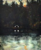
[dropcap style=”font-size:100px; color:#992211;”]T[/dropcap]he vibrant sculptures and paintings in Richard Stone’s latest exhibition at Kristin Hjellegjerde gallery evoke a sense of movement, vitality and timeless flux that conjure the “everywhen”.
His works are inspired by Sufism (Islamic mysticism), focusing on the divine and immaterial. As an Australian I cannot help but also see parallels with Indigenous Dreaming ideologies, which are often described within the context of the term ‘everywhen’. Both Stone and Aboriginal cultures examine the spiritual qualities of landscape, drawing upon the intrinsic to consider our place and purpose within an ever-changing world. This abstract approach marks a shift in Stone’s practice away from the stasis of found objects. His new works emphasise colour, mark marking and distribution of paint across the canvas to create a pulsating ‘life force’ that departs from a figurative vision of reality.
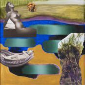
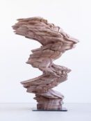
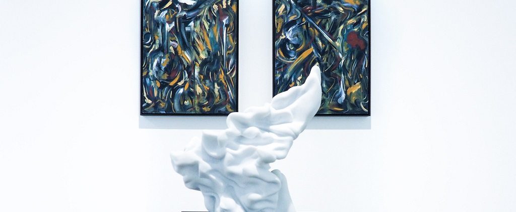
The exhibition consists of several paintings composed of swirling brushstrokes that are reminiscent of the rhythmic movement of Jackson Pollock’s paintings. Six twisting sculptures in white, red, grey or gold are dispersed amongst the canvases. These sumptuous forms evoke the flowing robes clothing traditional Greek and Roman goddess statues, bringing to mind the stately and opulent. Stone plays with different materials for each sculpture, including marble and porcelain. Those with a marble surface possess slightly harsher lines, as opposed to the softer, more liquid curves of the other sculptural works.
These two and three-dimensional forms of abstracted movement are very much complementary, conveying unique dialogues when placed next to one another. The different hues of the sculptures produce variation in the relatively uniform paintings they sit alongside, drawing out certain colours that give the works greater depth. For example, the red sculpture brings out the reds of the painting next to it, conjuring a different vision to canvases situated next to white sculptures. These juxtapositions of colour and placement influence the viewer’s interpretation of the works, highlighting their lack of fixed meaning.
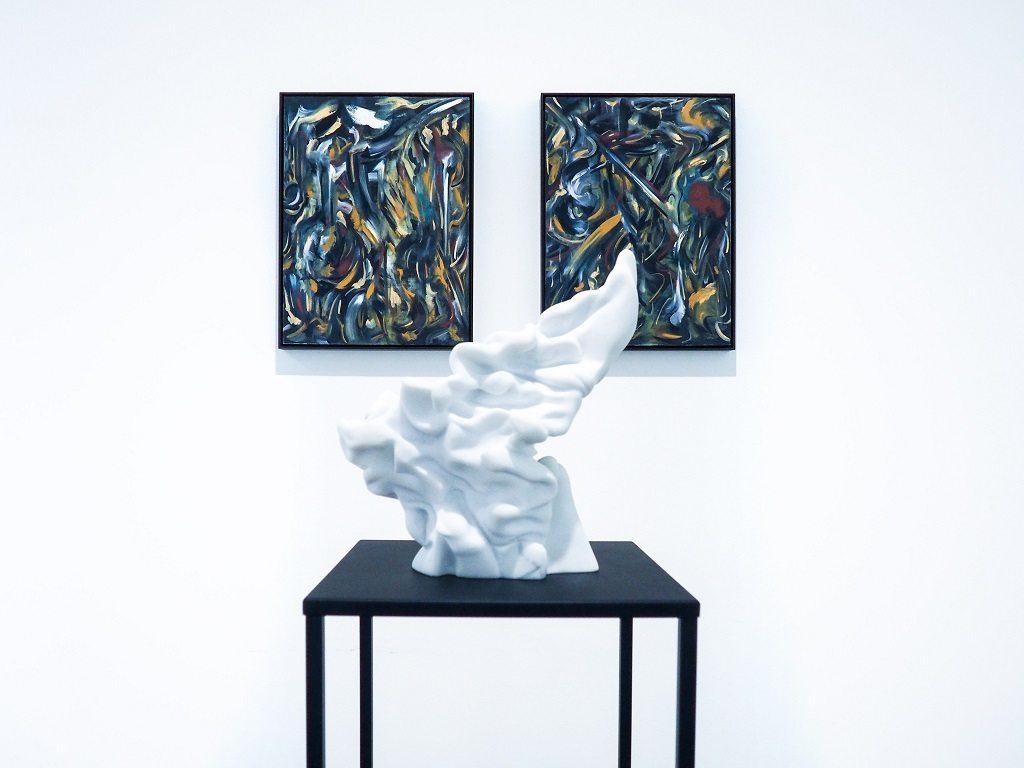
Richard Stone – “heraldic falling i and ii” (oil on plywood panel, tulip wood moulding, dark oak finish, 42x32cm/16 1/2 x12 5/8in each) and “looking for a place to land” (carrara marble, 20x25x20cm/ 11 3/4 x9 7/8 7 7/8in)
The changes in colour evident in the paintings themselves provokes different narratives and emotional responses. Some feature soft, pale hues, creating a more tranquil mood that contrasts to the brighter works, whilst several paintings in the final room are composed of darker tones that project a previously unseen intensity. Stone also uses titles and subtle symbolic elements, such as leaf imprints, to suggest landscape subject matter. Compositional figuration is most evident in the painting “The sky was like a sunflower”, which depicts a flat white line through the middle of the canvas and a white circle in the right corner, subtly creating a horizon line and sun amongst rapid brushstrokes. Whilst some works have similar directive titles, including “Passing through a parlour of winter trees”, others are more obscure and require greater inventiveness on the viewer’s part, such as “Searching for a siren”.
Through rich tactility and strategic use of colour and form, Stone collapses past, present and future, as well as moments of movement and stasis into a single moment.
8th of September – 7th of October 2017, Kristen Hjellegjerde Gallery