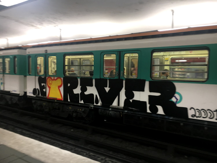
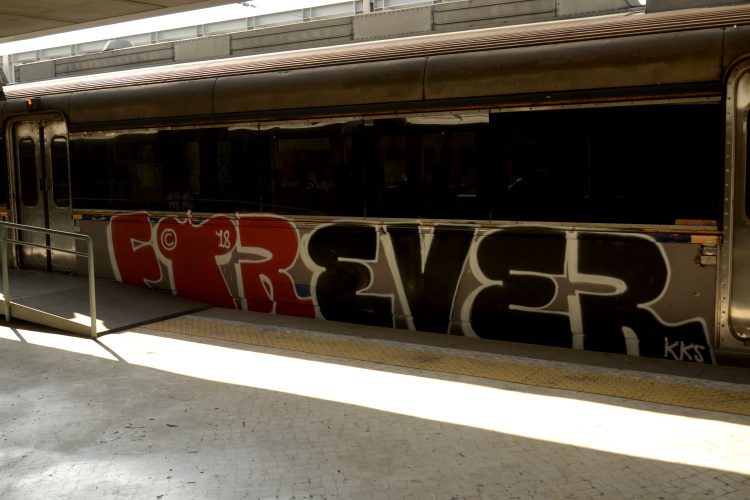
The immediacy of spray paint is truly democractic. It’s the hand against the machine. A slogan scrawled quickly and evenly against a whitewashed wall. There is a purity to what it could be. It’s meant to be seen, with a premium on hyper-visibility, a brave statement where the creative author needs to be hidden from the work.
The legal ramifications of being caught craft an efficiency, get in and get it done quick, before we’re recognised as the doer rather than the brand. The connection of spray paint, brand and expertise are long established in graffiti culture but not necessarily recognised by the public. Consistency and careful application may not come quickly to many people’s minds when they think of ‘the scourge of urban vandalism’. However, as academics like Erik Hannerz (see Trebuchet 5: Art and Crime) point out, there is a depth, reason and purpose to graffiti that is often positive and affirming. The artist’s control of the can is as much part of their signature as their tag or piece.
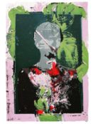
Bristol native Sickboy has been hailed as “one of the best street artists of our time” (Urban Nation 2021), gaining fame for using the symbol of a temple instead of a tag. A simple but revolutionary development of signature tag made Sickboy, along with other ‘post-tag’ graffiti artists such as Stik and Banksy, instrumental in widening the audience of the artform by moving to a more illustrative format. The conflation of graffiti and street art has gone through a more or less amicable divorce, with graffiti emerging as a recognised art form (with caveats, changes to format, and the reduction in the al fresco thrill of spraying upside down from a railway bridge) and artists like Sickboy exhibiting around the world to both critical acclaim and notable acquisition. Trebuchet spoke with Sickboy and asked him about what spray paint means to him as a material and what role it has played in his development as an artist.
“If I’m painting outside then it’s always spray paint but if it’s on canvas I don’t ever use spray paint. The point of spray paint for me is that it’s instantaneous, it’s got good coverage and by changing the thickness and firmness of the nozzle you can fill in quickly and blend colours. But with gallery-based work I use an airbrush because you can get those same qualities where you can blend or splatter while you can do dots, all the things you can do on a wall, but with fewer problems.
Going right back to 1998-2003 when I was doing quite technical pieces, I’d do stuff called cutting in. Cutting in is where you take the spray and you paint a wall white with spray paint and then spray a black outline on it. And then when you want to sharpen the outline up, you will go back over the outline with white. Then you half go over that black line to make it a sharp point. That used to be called ‘cutting in’ and or we’d refer to it as knitting because it was like doing crochet. You’d be knitting the details out. That was a large part of the way that I painted for quite a while and I guess after that you move on, don’t you? Now if I use spray, there’s rawness and I don’t need to cut in. I just want my solid colour outlining taken for what it is, which is quite an aggressive, instantaneous mark-making tool.”
Did people use those limitations to create styles?
“Yeah 100%. If you look at any of the pieces historically you’ll see different colours used for different reasons. If you’re going to paint on metal you’re going to use this colour, use this brand, and you’d have to really mix it up. We used to mix colours ourselves with a mixing nozzle that we made ourselves—two spray-paint nozzles joined together by a tube. We used to take the pressure off one can by putting it in a fridge, then you heat the other can up which would allow you to push white through to red and you’d end up with a pink can. We used to do all sorts of fun things. Other people might want to paint realistic stuff but I’m not that guy. For me, it’s bold, it’s instant and insistent and it has this punk edge which means not really caring about all the finickity little nitty-gritty details. None of those transpire in the photo anyway. It all looks clean when you take a photo of it.”
Can we talk about your temple logo. An icon and a brand—where did it come from?
“Around 1995 I started to question why we are spraying our names. Why are they letters? Why am I just camouflaging my letters, when to get the point across it’s just a symbol? You’d hear everyone going, “Oh, we’re spraying graffiti because all these advertising companies put adverts in my face and therefore I’m going to paint graffiti instead.” For me, it’s the same with logos and I remember so many more logos than fucking advertising campaigns. So I thought, I’m going to try to co-opt that and use a limited amount of colours and shades that represent what I’m about. And about that time I was really heavily influenced by the Viennese House Doctor [Friedrich Stowasser/ Friedensreich Regentag Dunkelbunt Hundertwasser]. His gig was trying to take back the formalisation of architectural space, as in Brutalism, and return it to nature. I thought, well, you know what, I’m going to take a bit of the Hundertwasser idea of beautifying buildings by putting the human hand back into the manmade architectural space. The main symbol that I use is the heart because there’s supposed to be a positive symbol put on shitty architecture and that’s what it has always been. The fact that it’s stylised is probably just me, just as if I was doing a signature. You know, after 10 years it becomes a bit more flamboyant.

The power button is quite hard to accomplish. You’re doing a circle then you’re trying to do a semicircle and then a line down and sometimes don’t have space for it. The thing they’re supposed to imply is that it’s supposed to be a living, breathing, little organic thing.
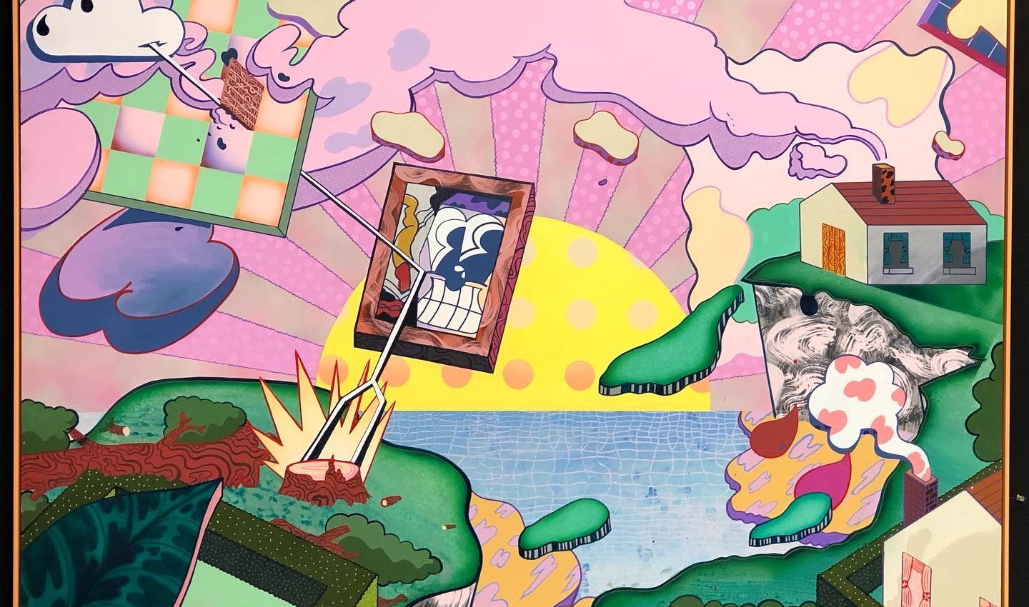
So you’ll see in a lot of my paintings how a lot of the elements are there. And then I’ll just go over it and if there’s not enough perspective, I might throw in a little checkerboard here, or little palms passing there, then you get a second explosion where you’ve taken a snapshot of a moment in time. It’s supposed to be as if you’ve caught a moment of something that never really happened. So none of this actually happens on the planet, but if you catch it, you can just inspire someone by going over what’s going on here.
With so many other pieces, you mark it out, you fill it in, you add the details, you do your final outline. Let’s be honest, it’s the same process as with any artist. For comic artists who were around before graffiti, they will do the same thing: fill, fades, outline, background, foreground. That’s what people were painting in the subway, starting from a way of creating artwork that doesn’t necessarily have to be spray paint. It doesn’t matter where you are environmentally, you’re still using tried and tested techniques to format a picture.
With graffiti, what inspires me is the freedom to not sit within the the uptight approach of fine art, contemporary art, and just being able to go, ‘Well, this is my playground, so I can do what the fuck I want’. That’s something I resonate with, being able to be slightly more free, I guess, not having boundaries. I know graffiti does have them but it’s still a freer step down from fine art circles.”
Sickboy @ fluorescentsmogg.com

The aim of art is to represent not the outward appearance of things, but their inward significance. – Aristotle