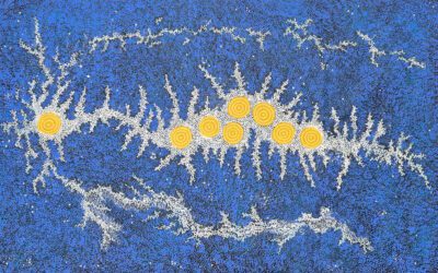
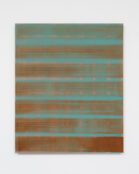
In this article I consider the work of Dutch West Indian artist, Nettie van der Voorst, in the context of concrete art: the collective name for a number of disparate practices that construct art as object rather than image.
We do not look through such works of art to access their content. Rather, the work is itself what we come to terms with, as content. Another, slightly different way of putting the matter, is to regard the work as an instance of the thoughtful content to which it affords access. This will become clearer, I hope, in the discussion that follows.
I
The distinction between primary and secondary qualities, as provided by John Locke, tells us that secondary qualities are accessible only to one mode of perception, so: colour to sight, sound to hearing and so on. Whereas primary qualities are accessible to other modes, so: shape to sight and touch. Primary qualities are qualities that things have in themselves, whereas secondary qualities belong to the appearances of things. Bats negotiate their nocturnal environment by sonic pulses; and so, they use sounds much in the way that humans use sight. What it is like for a bat to perceive its environment is different from what it is for a human to perceive hers. Presumably, bats discern shape through sonar scanning, sound — but not colour. (If so, shape is, in principle, available to sight, touch, and hearing and is therefore a primary quality. Since both sight and sound provide information exclusively to humans’ eyesight, and exclusively to chiropteran earshot, respectively, colour and sound are secondary qualities that put us [and bats] in contact with the primary quality: shape.)
Suppose now that someone says that seeing a telephone box and noticing that it is red is to make an ascription that can be verified in terms of the light waves emitted by the object. This is the claim that secondary qualities can be re-described in terms of primary qualities — that the former rest upon the latter. It is unlikely, however, that any such claim could be convincingly established. Even if it were, it would not give us what we want. What we want is an account of what it’s like to see the red of the telephone box, over there. We do not see light waves; only colours. (Dobson & Teleagă 2020.)
II
Those of us educated in art schools, and others interested in colour, will be acquainted with the colour wheel, as introduced by Goethe. As it spreads out from primary to secondary, to tertiary colours and beyond, we end up at a circumference of colours each of which blends into the next. Why is the colour wheel circular? (Wavelengths do not explain this.) Tonal distribution from white to black, by comparison, is linear. And if we think of a cylinder with the colour circle at its equator, and the tonal range as its vertical axis, we can imagine that the entire range of colours, shades and tints are accommodated therein. The absolute centre of this cylinder is mid-grey. As the colours approach the axis they are muted toward the middle, tinted toward the top, and shaded toward the bottom.This three-dimensional image seems to provide us with a colour geometry. It seems to provide us with subjective necessities analogous to the logical necessities of geometry.
Main image: photo by pexels-pixabay-colours
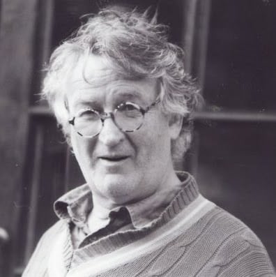
Ed studied painting at the Slade School of Fine Art and later wrote his PhD in Philosophy at UCL. He has written extensively on the visual arts and is presently writing a book on everyday aesthetics. He is an elected member of the International Association of Art Critics (AICA). He taught at University of Westminster and at University of Kent and he continues to make art.


