At the suggestion of Art director Dale Doyle artist Michael Carson was chosen to paint the cover of Matt Berninger’s (The National), now acclaimed, solo album Serpentine Prison. The rest is history.
In 2020, after a period of back and forth eventually an idea emerged which coalesced in a spectacular portrait which charts without limiting the many emotional stations of this complex and lingering album. Anxious, wearily energetic, engaged and cynical with a grey blue sky of claustrophobic hope the Booker T. Jones (Stax records) produced album reached several toplists in 2020 and continues to find wise listeners. While not intentioned as a lockdown album the hymnal intimacy of the album shows depth, artistry and understanding, it makes being alone a sacrament rather than a sentence—hallmarks of a classic.
The Painter Michael Carson
Approaching painting with a combination of realism and painterly flourish, Michael Carson has built a reputation for his Impressionistic figural works. Often featuring lone women in shallow spaces and rendered with muted, earthy tones his work shows the influence of painters such as Henri de Toulouse-Lautrec, John Singer Sargent, and Norman Rockwell.
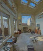
“My work is first and foremost figurative studies. It’s what I like to paint, my biggest challenge and my greatest payoff. My nondescript surroundings help me create a mood or a story that I am trying to relay through my painting. Inspiration comes from architectural interiors and fashion. My work allows me to explore and explain this side of myself. Seeing how the work evolves, the subtle and the drastic differences, and looking forward to the future keeps me painting. I view a painting as a success when I take from it something new that follows me into my next work. It’s just about learning to become a better painter.”
Partnering with Trebuchet to support the building of a network of fledgling art collectors Matt Berninger and Michael Carson have signed and numbered 200 prints of the cover painting. So, while stocks last new subscribers to Trebuchet magazine (£42 UK / £70 Worldwide, price includes postage) will receive a limited edition print of the Serpentine Prison artwork. To support the project there are a limited number of free prints and then a sliding scale of print prices.
Click here for purchase details

The story behind the artwork for Serpentine Prison.
Painter Michael Carson, Art Director Dale Doyle and The National’s Matt Berninger talk about art, the music and the process.
Trebuchet: What is your favourite song on the album and why?
Dale Doyle: This is a tough one. Initially, “Distant Axis” was the song that felt like a huge hit on the first listen. I love when songs hit me like that, as if I’d heard it a million times before. That said, as I spent more time with the lyrics, “All For Nothing” really resonated with me. As we all know, Matt has an incredible gift of writing every day feelings in really fresh ways and this line hit me like a truck: “Go on float away, don’t try to orbit me / They say it’s hard to live here / No one comes around, I got no gravity / The weather’s unforgiving.”
Michael Carson: Currently I’m wavering between “loved so little” and “One more second” for very different reasons. I love the R&B base vibe and the slow build that happens in one more second. Loved so little is more like my soundtrack while I’m driving through the desert thinking about how wronged I was during my last spousal argument. I love the layering of instruments in unique moments all over this album.
What is it about this artwork that fits the album for you?
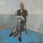
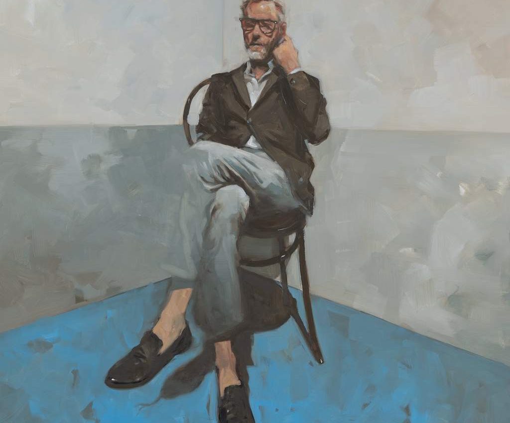
Michael Carson: The art is in some ways a traditional portrait with my style put in for good measure. Matt is proportioned in a way that makes him feel alone and cornered in a room, which was the mood I intended.
As a creative person, we all basically spend a ton of time in a room, alone, thinking, and working on things. We all have this in common. This album felt very introspective and personal so I wanted it to feel that way—like catching someone in the middle of a thought. One thing I did during our (or any) photoshoot is to look for natural movements and idiosyncrasies that are specific to that person. The trick is to say you photographing on three and then take the photo on five, right after they’ve stopped trying to pose. That in-between thought that’s what I wanted.
Dale Doyle: My entire career has been built around bringing brands to life with a design brief, just words on a paper. There was only one slight difference with this project. This time the brief was all the songs he had written for Serpentine Prison. They have this beautiful, brooding feeling to them, feelings that felt like a Michael Carson painting.
I was fortunate to have the album well before the release, and that gave me time to dive deep into the feel of the album and bring it to life in a way that felt like the perfect marriage of song and art. Michael is my favourite figurative painting living today, and his graphic design background comes to life so well in all of his work. This album gave me the perfect opportunity to reach out to him and see if he was interested in partnering with me to bring this album to life. He’s a huge fan of The National and didn’t hesitate to be a part of this project. Five paintings later, we landed on the two that you see on the LP, and the stunning portrait on the deluxe album.
What is it about this portrait that captures Matt’s essence?
Dale Doyle: Matt has these mannerisms about him, especially his hands, they’re an important part of his act. So, just that simple gesture of him scratching the side of his head, in this very natural way, felt like a Matt thing to do. I also love this idea of him being dressed up for a live performance that never happened because of Covid. Let’s all hope that changes soon.
How did you three get together to come up with the artwork?
Dale Doyle: It’s funny, the power of social media, brought us all three together to bring this to life. Prior to me meeting Matt online I actually had a conversation with Michael a couple of years ago just because I loved his figurative painting, started following him on social media and actually met him a year and a half ago at his home studio with my son, and always wanted a piece of his work. And then, Matt, I’ve been in love with The National for decades, and started following him on social media, and he had some funny posts, I think he was licking a pole or something. I said that was such a West Side move, we both grew up on the West Side.
I guess he looked at my design site and said, I’m working on several projects and I’d love to get you involved in them. And I’ve been working with him a little over a year now, I think. Several of his projects, of course the big one being his debut. That’s how it all worked. And as I dug into designing his album for him, I came up with 10 concepts. Initially, he wanted to use this really beautiful shot of him and Booker in the studio that really resonated with him, and then another shot came up of him trudging through the mud. Was that with your daughter and your nephew or something like that?
Matt Berninger: My daughter and one of my daughter’s best friends. It was low tide up in Maine at a friend’s house. It’s just such a weird photo I thought that could be something. I had thoughts on it and different ideas, I wasn’t sure. But Dale was the one who broke me out of all of the obvious ideas I had had. You brought up a portrait, but it wasn’t till you showed me Michael’s paintings that I was like, ooh, okay.
Dale Doyle: Yeah. I was fortunate to get a cut of the album in January, February from Matt. So I was able to take that in and and really reflect on the mood of the whole album. And Michael just felt like the right painter for the album. And I called him up, and he’s a huge music fan and certainly a fan of Matt and The National, and was on board in seconds.
Michael Carson: That was one of those things where he calls me up and says, I’ve got this concept, are you interested in doing it? I said, yeah, of course. And he’s like, well, I’ve got 10 concepts, I’ve gotta go through art directors, I’ll get back to you if it works. I’m like, I’m never gonna hear from this guy again.
What ideas did you discard? How did you get to the find concept?
Dale Doyle: Matt can explain more about how he came about Serpentine Prison, but for me, it was a connection for us. In Cincinnati there is this iconic wall that snakes around the Ohio River on the riverfront downtown, that’s actually called Serpentine Wall. He has this beautiful song called “Silver Springs” one lyric in it is swimming away or floating away on a glass-bottom boat. I actually had this paper sculpture idea of an overview of the river and the wall that snakes. But definitely over the moon on where we netted out on this, and the deluxe album is beautiful as well.
Did you guys listen to the album together once it was all coming together? Mike, when you were doing the painting, did you have the album playing?
Michael Carson: There were times when I was listening to it while I was painting, but I did do 10 sketches, five paintings, so there was a lot of work involved. I definitely listened to it at some point during the time I was painting, for sure. Which I do in my studio every day anyways, just to set my mood, finding out what I’m feeling like. One day it’s Matt Berninger, the next day it’s James Brown. It depends on what I want to do in my studio.
Art is often quite reflective of the times that it’s made in. This wasn’t intended as a Covid album was it?
Dale Doyle: Not at the time, because it was pre Covid. I feel like I got Covid in LA when I was with you, Matt, that last time, I came back feeling terrible. And then all of a sudden March hit, and I’m like, wait a second, what is going on here? So it’s weird in retrospect, looking back to it and the meaning behind it, and the fact that he’s sitting in the corner on this really fragile French cafe chair. It’s like, wow, there’s this isolation to it that we didn’t see coming. But here we are.
Matt Berninger: I’ve been asked that question so much about this record and the current time. I don’t remember when we took the photos for the cover and the painting. I don’t even know exactly, Michael, when you painted this, but I feel like all of it, none of us had anything like this in mind. But it’s one of those things, it’s like I think we’ve been in a state of strange, emotional paralysis and locked down Americans for a while, for obvious reasons for political and environmental reasons, everything. So it doesn’t surprise me that the whole mood of a lot of art (not just mine), a lot of things coming out right now, resonate because our pandemic time. Yes, there’s one thing that’s drastically different, but the rest of the world that we’ve all been living in for a long time is drastically the same, unfortunately, in a funny way.
I did want to ask, when we took those photos, I was always more concerned about the couch and the chair and what I was sitting on, cause I knew that I was going to be in good hands or whatever, however he was going to paint me, but I was just like, the environment of where I’m sitting was really tricky. Like, that’s not my house. A friend of mine who’s also a painter and a designer let us use his house because I knew he had a lot of cool couches and whatnot. But I remember when we shot that, Dale and Michael, that whole thing of just like trying to find the right me getting comfortable was more important than anything else. I was never actually sitting on a little chair in a corner like that. If I remember, Michael constructed a lot of that.
Michael Carson: I did. When we had taken those original pictures, you were always on a very heavy, large couch, which was very cool. But somewhere along the lines during this painting, just as I’m starting to paint it, I just last-minute decided it just felt too solid, it felt too something. And so I just went back and did one of my old French bistro chairs, and all of a sudden there was like this fragility, and the perspective put him in this corner. So everything worked out better for me just by changing up the background and the furniture. So the pictures were taken specifically of him, but I almost completely ignore the background unless they just work out perfectly. So it was one of those things that was a last-minute decision, and it gave it a completely different feel.
Matt Berninger: Yeah, putting me on that fragile chair was such a brilliant move and made it work so much better.
Michael Carson: You know, one of my favourite parts, is I sent that painting away. You never know how someone’s gonna react to see a painting of themselves, you know? And I sent it off to Dale and he says, I’ll get back to you. I may be getting this a little wrong, but Dale said, that shadow underneath him, Matt thinks it looks like a shadow of a coiled up snake. So maybe we can play up on that a tiny bit.
Matt Berninger: You didn’t paint it that way, originally?
Michael Carson: That was not my idea. I’m so pissed that that was not my idea!
Dale Doyle: I thought it was mine.
Michael Carson: I’m still upset about that to this day, I missed that!
Dale Doyle: When I saw that, I was like, that looks like a python.
Michael Carson: You could’ve let me find that, a few more minutes was all I needed!
Dale Doyle: I kept thinking that you’d done that, and I was wondering, but it didn’t reveal itself so clearly until you put the tongue on. That’s a great example of [serendipity]. It’s like a surprise where you’re like, oh, that’s the best line of the song, and it’s because I put two longish lines together that weren’t supposed to go together, and then you realise you’ve got something. I love when that happens.
Michael Carson: This was my first time collaborating in a long time, so just to have other inputs come in was just so refreshing for me. It’s one of those things that I realise I enjoy more than I think, and I should do it more often. Just to get other artistic opinions.
Dale Doyle: Yeah. I think that took a great painting and pushed it over the top. It’s one of those things that if people don’t see, it’s fine, but once they do, it’s a mind-blowing moment of holy shit, there’s a snake underneath his chair. But there’s the other subtle things in the album, like that line that’s in the middle of that wall, that connects beautifully to a line back of the album. It just fits together so well.
Matt Berninger: Yeah. One of the other reasons I really connected with Dale was I could tell we went to the same school, or at least there was a thing about the way Dale talked about ideas. We both went to the same design programme at University of Cincinnati called The Design of Art, Architecture and Planning. And we both had a lot of the same professors. Dale, you graduated a little before I even entered, right? So you were like the generation before me, and the record is dedicated to my aunt and to my professor, Gordon Salchow, who Dale also had and was a big hero of his. And so for me, it was really amazing. And Scott Devendorf from The National also went to school there, and it’s where my first band started and everything. And so to work with Dale and be able to talk with another designer who has taken his career all the way to where I expected to go with my career, if I was lucky enough, to start your own firm and have your own clients and your own studio and everything with all your friends is the greatest dream of a designer, I think. And here was Dale, who had reached that, and to be able to work with Dale and to do that. And then like Michael was saying, I collaborate a lot with music, and that’s a whole one collaboration. But to be able to just really dig in on a design project again like I used to, for five years of college and then 10 years or 12 years of professional life was a real joy. Just working on art projects with friends together, I miss that so much, too. That was just sentimental.
Michael, I love how geometrical, your paintings seem really organic, but you do so many graphic things. Like you said, you removed people from backgrounds and you make sure that the background itself is compositionally or thematically adding to the painting in some way, not just as a background.
Michael Carson: My background is design as well. So I didn’t do a single oil painting until five years out of art school, I was doing computer stuff all the time. So having that background I found beneficial to the organic world of oil paint. I went to the Minneapolis College of Art Design.
Matt Berninger: Dale mentioned this, that you didn’t really start painting until you were in your 30s or close to your 30s.
Michael Carson: I was drawing Winnie the Pooh 24/7 for a company that did licensed products for Disney. I’m not kidding. In fact, if you look at my signature today on my paintings, it’s in Pooh font. So it’s in my head, you know. But anyways, that’s a whole other story. So I had come from a corporate environment where I was working with a lot of people and in design groups and whatever, and I hadn’t done that for 15 years, so this was awesome for me. And Dale is always very quick to give me a painting which I love. Some people are just so careful around artists because you don’t want to hurt their fragile feelings. But Dale was just like, nah, I don’t like that one, try something different. I really appreciate that.
There’s some really lovely colours on the painting can you talk us through those choices?
Michael Carson: Well, the play of light sources and light stuff is just something I do strictly as a design element, because I realise in painting, even when I’m painting people, normally, I’m using different references, different faces, and different bodies and different arms. So you get different light sources, and as long as the painting is put together well enough where people don’t even question that, no one even seems to notice that there are multiple light sources happening in a painting. Because offscreen there can be different lights and lamps and whatever, so no one questions it. But if you look at a lot of my paintings, you’re going to see that there’s different light sources happening. It’s just very subtle.
There’s a really nice compositional thing where there’s the two-toned background and the horizontal line. It is reminiscent of the 50s and 60s in some way.
Michael Carson: That’s just me coming up with the simplest architectural background that I can come up with, because I don’t like fussy paintings. And even the ones that I do backgrounds and paint in detail more, they’re still very subtle colour wise. I just love that horizon. This was a little more specific because of the corner floor, but a lot of my paintings they can be outside, inside. It’s just a generic separation of horizon. You see this where I used the floor and his left leg pants, they run into each other. Just for a little tension.
Matt Berninger: I like the choice of putting me in a corner too. I hadn’t totally thought of that, but once you sent these back, this one particularly of me in the corner, it reminded me right away of an album called Boy in da Corner by Dizzee Rascal. It’s like the lines and stuff, and I was like, oh my God, he did a Dizzee Rascal for me. All those little things, I was really grateful to the level of which that you and Dale just thought about the whole painting and all. And you did so many different paintings.
Michael Carson: I was having fun. Yeah.
You’ve lived with the artwork now for a long time. From the immediacy when you knew that the pairing was going to be that way, have you discovered anything more about it over time, more revelations in things that you like about it, that weren’t there immediately?
Michael Carson: When you’re so intimately involved in it, you pretty much figure out every aspect of it as you’re painting. It’s like there’s no tricks for yourself as the artist because you know how you accidentally made something happen. One of the cool things was that after all said and done, I got this final version after seeing many, many versions of fonts and stuff like that, and Dale decided let’s just not put anything on the cover. We know who this guy is, what’s the point? And I thought, wow, what a simple solution to very difficult problems with font and type and stuff like that. I love it even more. I just thought, what a cool concept, just put the image out there as a piece of art. And I don’t do prints, so this is literally the only place someone can get a print of my work (Michael and Matt made the Trebuchet Limited Print a rare exception – Eds), as well as an amazing album. So it’s a cool combination in a way.
Dale Doyle: It was interesting in the middle of the production process for me when I was getting all the files put together and Michael had sent the hi-res scans off to me. It’s like, now that I’m looking at these, I’d love to change them up a little bit. Do not change these three, you could do whatever you want with the other two.
Michael Carson: I did change these three, it’s very subtle.
Matt Berninger: What did you do?
Michael Carson: Oh, just a broad brush stroke here and there. I’m not going to give away anything.
Matt Berninger: Enormous changes at the last minute is a philosophy I definitely abide by. I would say the thing that made it so much fun with Dale and Michael, is the whole system that Dale designed for not just this album cover and the insides of this one, but the singles and the deluxe. And Dale even designed the logo for my record label,, and Dale’s designing the T-shirts and Dale’s designing the stickers, and Dale’s designing my entire universe.
Just to work with somebody who thinks about a project, it’s not just like a one-off work of art but a brand and a system. It’s what I come from, is branding and advertising and design systems. And just to see someone building a system like this around my record, and my songs, it was so fun to be the client.
On that basis, did you give Dale a brief in that respect or did you give him a free hand to come up with some concepts and present them across to you?
Dale Doyle: No, it was really open. I think you came to me with like two ideas and I just wanted to expand on them. And that’s when we got together in Venice and I showed you all of those concepts.
Matt Berninger: When Dale says expand on my ideas, he means throw mine away. I was going to do a Marina Abramovic thing and just sit there in a chair and be like, meet my record. Everyone could give their thoughts on my record and I can’t respond.
Dale Doyle: He has a brilliant way of deciphering the designs. Even the small builds actually turned out to be huge builds. I think that’s the beauty of collaboration when three minds come together.
Matt Berninger’s Album Serpentine Prison was release on Oct 16th 2020, the deluxe version of the album is now available from his website.
Partnering with Trebuchet to support the building of a network of fledgling art collectors Matt Berninger and Michael Carson have signed and numbered 200 prints of the cover painting.
So, while stocks last new subscribers to Trebuchet magazine (£42 UK / £70 Worldwide, price includes postage) will receive a limited edition print of the Serpentine Prison artwork.
To support the project there are a limited number of free prints and then a sliding scale of print prices.
Album Design by Dale Doyle @ Holotype Studio
Artwork Michael Carson

The aim of art is to represent not the outward appearance of things, but their inward significance. – Aristotle