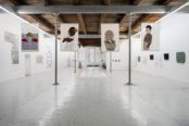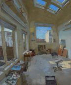
[dropcap style=”font-size:100px; color:#992211;”]T[/dropcap]he Ceri Hand Gallery has only recently found it’s place in London, but what a place it is.
A wonderfully compact upper floor with the usual gallery reception desk, which as usual never appears to be occupied, leads to a small side room with large windows and then another set of stairs takes you to the basement, a giant of a space.
However I am not an estate agent trying to sell you a residential letting, I am an art reviewer and I must turn my attention to what’s contained within such an extravagant central London space. It does not bode well that I spent most of my time at the exhibition in awe of the basement, instead of attempting to be in awe of the art work.
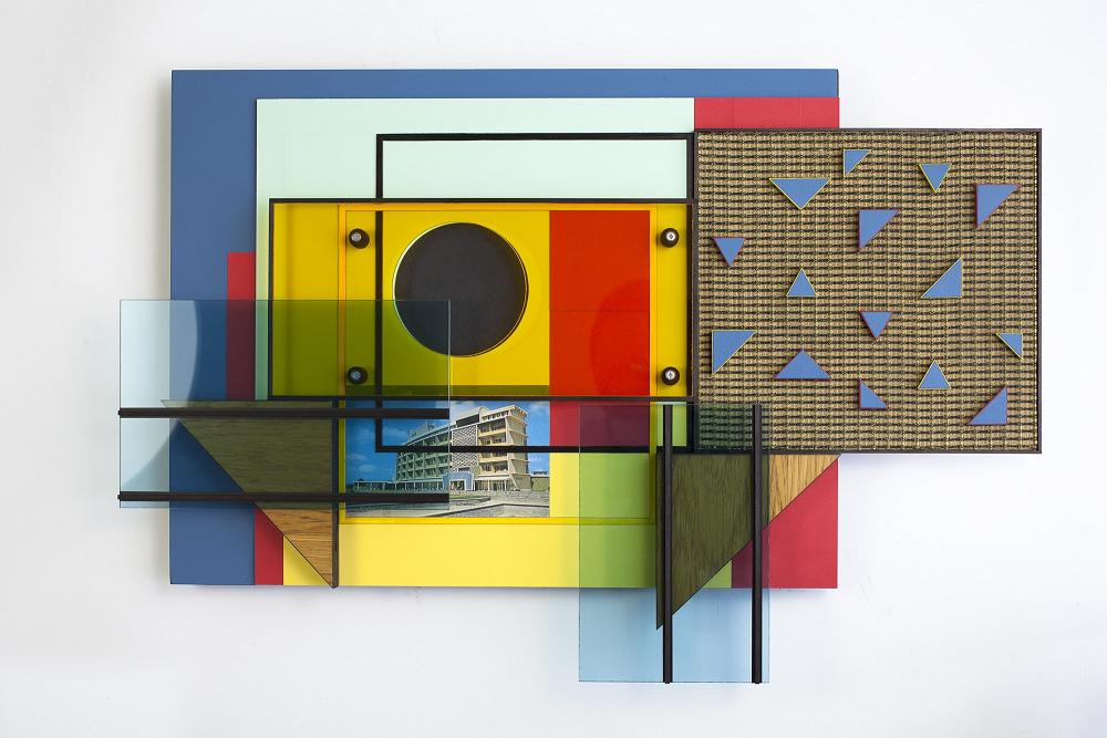
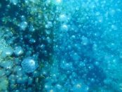
Oceanic 2011 / 2012 Mixed media
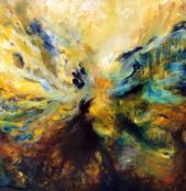
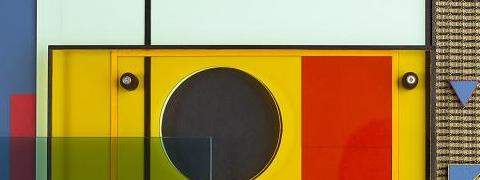
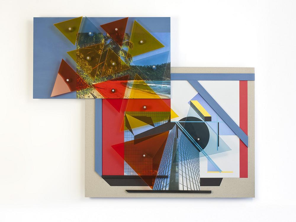
The first piece I encounter in Matthew Houlding’s second solo exhibition, The Oceanic, is a rather demure and delightful abstract titled ‘The Silent World’. This vivid work contained a miniature landscape photograph of a palm-strewn beach, framed by a mixture of plastics and wood in vibrant colours, a recurring mixture throughout Houlding’s work.
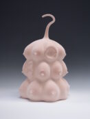
I soon found out that ‘The Silent World’ was probably one of the calmest, most subtle pieces in the entire collection. Turning a corner I find four islands in similar bold shades, small statues reminiscent of KerPlunk or Octons. These are the ‘New Olympia’ range of sculptures and despite them conjuring images of hamsters selling stocks, I found myself drawn to the interlocking materials and asymmetrical balanced structures.
[quote]hamsters selling stocks[/quote]
These are the pieces I returned to once I had examined the rest of the exhibit, these are the sculptures I continually found new aspects to discover long after my second examination, these are the works which made me see potential and innovation. They also assisted me in my interpretations of the rest of The Oceanic exhibit, in so much that I now accepted that Matthew Houlding was capable of nuanced and bright architectural styles.
The Oceanic exhibit took it’s name from the Oceanic Hotel. Kenya-based and now demolished, the structure was known for being designed by German architect Ernst May. An example of Modernist architecture and the East African tourist industry, Houlding’s clear fascination and admiration for this type of design, use of colour and opulent practicality shines through in his exhibit.
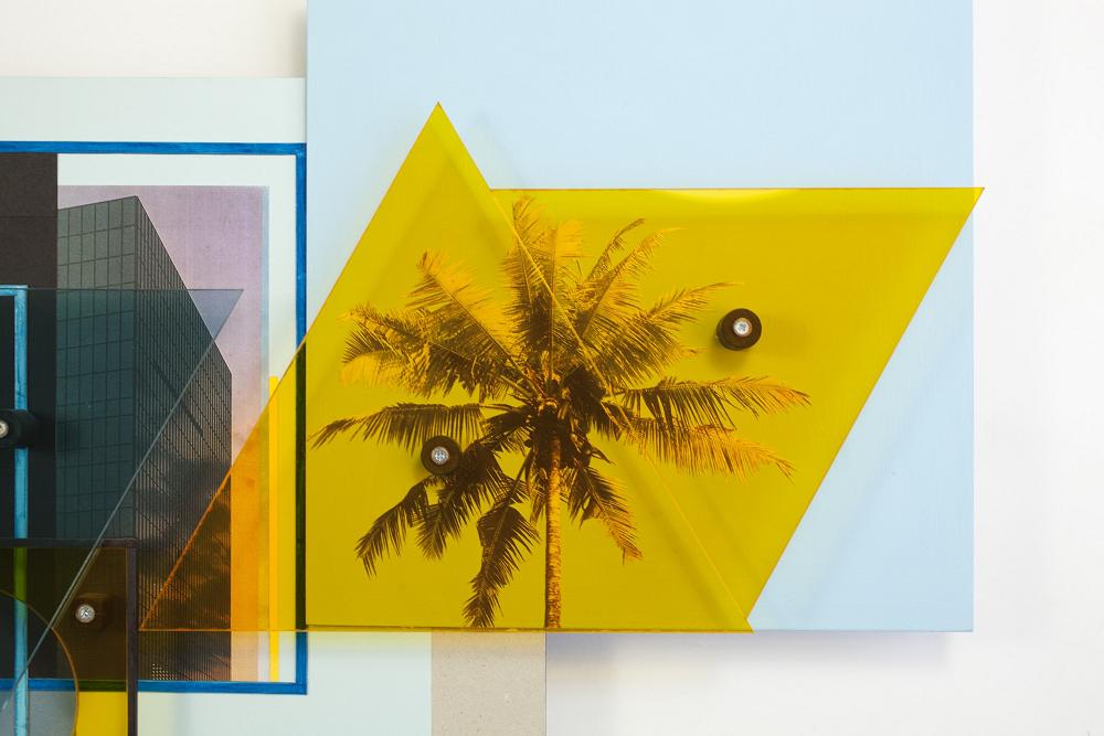
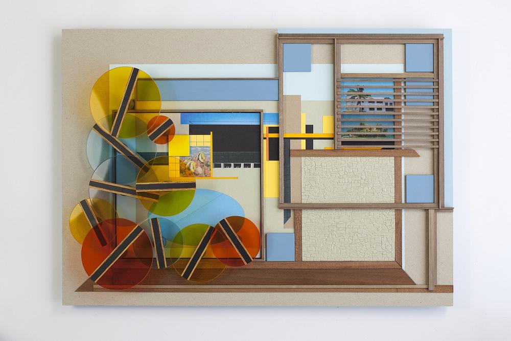
Within the same floor as the geometric oases were more views of palm trees and luxurious hotels in the sun, each of these filtered with plastic shapes in oranges and blues. ‘Chainlink’, ‘Sweet Lips’, ‘New Cairo’ and ‘Sand Island’ all contained lattices of Perspex colour and occasionally featured small rectangular windows onto the landscape, with their own set of blinds.
New Cairo 2011 / 2012 Mixed media
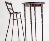
Though jovial and obviously symbolic of the exhibit’s namesake, these images held no warmth or beauty beyond the kitsch dynamism of multi-coloured prisms. A pair that did catch my attention however, were a large photograph named ‘Kilimanjaro’ and what could be an architect’s building model called ‘ The Outrigger’. A simple duo, these exemplified the paradise imagery and the architectural designs which were at the centre of Matthew Houlding’s exhibit, but lacked the overused distraction of colours and materials and therefore relied on their own intrinsic properties.
‘Kilimanjaro’ was a picture that denoted tragic emptiness despite it’s exotic location, corresponding to the lack of completion that was belied within the isolated structure of ‘The Outrigger’. However these pieces were definitely made from a different mould than those displayed in the aforementioned spacious basement, and in many cases a mould was literally used.
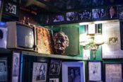
I am taken by surprise as a carved face looks out disapprovingly from a chequered diamond of yellow and blue, fastened to a shelf at the bottom of the gallery’s stairwell. I realise that this is not a shelf but ‘New Africa’, a testimonial wall mounted artwork which features the Bauhaus logo and a variety of other explicit symbologies.
Sand Island, 2011 / 2012 Mixed media
This area of the gallery is comprised of larger landscapes that could be mistaken for 80’s geometric shirts, a series of modest but optimistic abstracts called ‘Teardrop’ and a handful of freestanding sculptures. The ‘Teardrop’ series contain vacuum formed plastic pools with wooden decking and bronze lattice awnings, the only thing missing was the patio furniture and scantily clad Barbie doll.
Each pool was a distinctive shape and possibly snatched right from a catalogue, this being the clear goal of the series. Nostalgic about luxurious habits of an opulent era gone by, I found ‘Teardrop’ didn’t bring tears to my eyes but a little bile to my throat. They annoyed and bored me, retaining none of the quirky beauty of Houlding’s Spirograph landscapes. Even when compared to his grander sculptures, which were practical and playful if a bit trite, these pieces were left lacking.
Speaking of these sculptures, ‘Seahorse’, ‘Veranda’ and ‘Poolside’ were the epitome of The Oceanic’s style, combining materials, colours and shapes to produce bold playgrounds. They divided a room, filling it with light foliage, bright lattices to examine and even a Hawaiian shirt to wear. Immediately one thinks of tropical bars and surfer clothing shops.
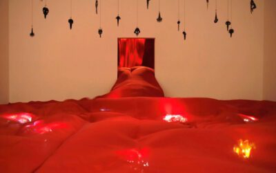
Under the Black Sun of Joy, 2011 / 2012 Mixed media
I felt like I had wandered into a theatre set for Abigail’s Party, any minute now an aging starlet would start making cocktails and offering me pineapple and cheese on a stick. Certain that these works were meant to emote some of this form of response, if not all, I can only say that the pieces accomplished the artist’s intent. Nevertheless, the neon faux foliage growing from MDF flooring, a stool tucked into a crochet style desk and the lean-to yellow and blue bookcase, produced an incredibly strong association to Ikea which overpowered all other imaginings.
It looked like the pieces should be called Svenis and sold in flat pack at the back of the immense basement gallery.
Despite my chagrin and any underlying connections of Matthew Houlding’s work to a period wasteful luxury and current sustainable furniture production, I found The Oceanic an intriguing exhibit. Leaving the cold of snow-strewn January for one evening, to view far flung landscapes imbued with warm yellows, enhanced with rich sea blues and framed with complex shapes was a nice diversion. One I would recommend to anyone who misses the ocean (and playing with Lego).
Matthew Houlding – The Oceanic
Ceri Hand Gallery
11th January – 9th February
71 Monmouth Street, London, Greater London WC2H 9DG
All images by Simon Pantling and are courtesy of Ceri Hand Gallery .