[dropcap style=”font-size:100px; color:#992211;”]I[/dropcap]n any exhibition the initial point of interest – quite apart from the artwork itself – is the large passage of floating words that introduces the exhibition.
Probably conceived by the curator, art historian or copywriter, it looks almost like a painting in the gallery context, a fuzzy black rectangle of individual letters stuck on the customary white walls. It’s an interesting moment in an exhibition, because it often subtly sets up a concept, a conceit even, of the body of work on show, or an angle at which to reconsider the artist. 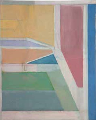 At this point, as soon as I’m inside the first doors and settling in front of this principal paragraph, I often notice my inability to actually read. Something happens to my brain, which returns all visual information to near-wordless experience. Even the shadow of the fidgety gallery assistant with her press-day clipboard seems watchable. The Richard Diebenkorn at the Royal Academy of Arts exhibition returned me to a kind of free-fall bliss of the iris.
When we read our eyes follow the taut little tight rope they have been trained on, close and careful to the line. But having walked in a straight line as far as I could, I turned away from the words and to the paintings beyond, which expanded my eyes as though they were being breathed into, widened by the canvases’ size and the sheer grace of their colours. Although I tried to make myself follow through to the end of the Introduction, I could almost hear the paintings and their shapes moving behind me. For the sake of giving some useful context I will quote from the opening passage, which begins:
‘Richard Diebenkorn (1922-1993) is celebrated as a post-war master in his native United States and is closely associated with the West Coast, where he lived and worked for most of his career…’
This blurb suggests the link between the paintings and the places where Diebenkorn was when he painted them. It’s not uncommon to link paintings to an artist’s surroundings; in fact, it seems obvious that one’s immediate reference points – a room, a country or a view – might find their way onto the canvas, but an artist could just as well paint themselves out of where they are, or deliberately paint over what they see, and Diebenkorn himself has said that he was unaware of his surroundings as an artist.
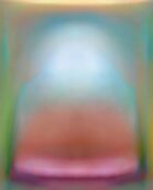
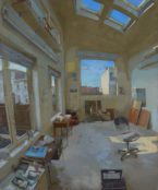
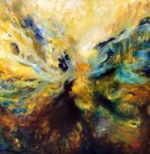
Nevertheless, the exhibition’s structure is conceived around locations, and the paintings themselves are very often simply named after places, as in The Albuquerque series. However, as I went along, the link proved to be a very suggestive way of looking at the paintings, if only because it provided a questioning framework for each painting. Some canvases seemed obvious places, like the recognisable, and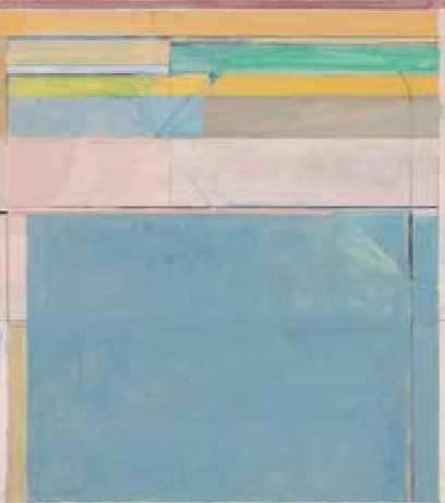 recognisably named Cityscape #1, others hinted at aerial views or the corners of rooms, but especially with the Ocean Park series [right, above right], there seems to be a consensus that the paintings are characteristic of Southern California. Diebenkorn never intended these large abstract paintings to be landscapes, but if a painting can be about landscape – without portraying it – then these paintings are. This distinction perhaps gets us closer, as close as we might want to come in words to something visual, to the pleasure of Diebenkorn’s paintings. They seem to draw lines around their subjects, to discuss themselves, but not observe in a way that seems futile or limiting.
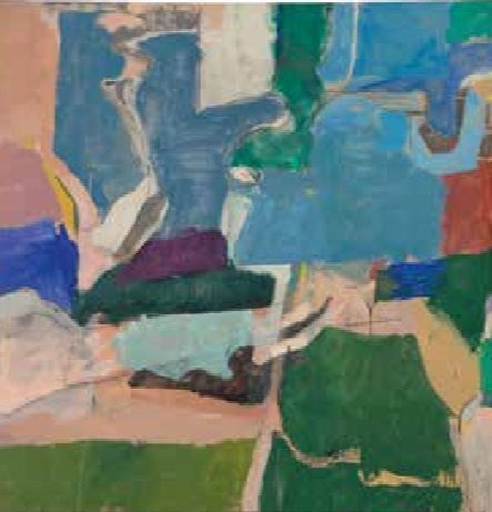
I could spend time outlining Diebenkorn’s life here, but it would be time wasted in which you could be looking at the paintings, or making a painting yourself, or looking out of the window very closely. I can describe, though, what I think I saw, or rather what I saw and what it made me think. The first room, Early Abstract Works, explores the work he made in the 1950’s in Albuquerque, New Mexico and then in Urbana, Illinois. These paintings seemed an exercise in escaping points of focus, the paint shrugging the eye off whenever it tried to rest on it, keeping the gaze moving over the canvas. Looking was like following one idea over time, and watching it shift about. A swipe of a finger had smudged a bit of paint away in one spot, a curved line led over to a moment of red paint elsewhere. These ‘moments of red paint’ occurred more than once, in several paintings, as though he couldn’t help himself, and I felt as though I could empathise with each red moment.
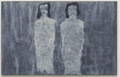
Where the first room felt as though the eye was being introduced to the randomness of the world’s shapes and colours, the middle room – The Berkeley series: figurative work (1956-66) – seemed to be full of world-weary distraction and common sense.
 Berkeley #5, 1953. Oil on canvas, 134.6 x 134.6 cm. Private collection.
These years of his figurative work, paintings of things, seemed dull and lifeless comparatively, still lives of still life. Some of the colours he used in this period have a straight-out-of-the-tube quality, which could at turns be unexpected and knowing or otherwise disappointingly pragmatic. But it was perhaps only comparatively less exciting than the previous room, sandwiched between his early abstractions and his later return, in the third room, to not explaining himself so eloquently. In any other exhibition I would have enjoyed drawings such as Untitled (Striped Blouse), (1966), a dribbly ink study of a blank-faced girl comprised of thick black lines from the pattern of her top, or Ashtray and Doors, (1962), which was a pretty and compact Matisse-like sketch. So much of art and its effect – as the strange phenomenon of the exhibition always reminds me – is defined by context.
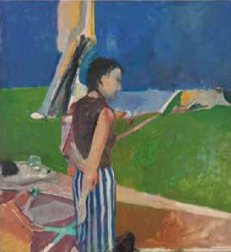 Girl On a Terrace, 1956. Oil on canvas, 179.07 x 166.05 x 2.54 cm. Collection Neuberger Museum of Art. Purchase College, State University of New York. Gift of Roy R. Neuberger
Entitled The Ocean Park Series (1967-88), the third and final room seemed larger than the other two. The paintings managed to create a sense of colossal space that wasn’t there, large canvases of muted milky layers of paint, with thinning lines of near-colour at the edge of the canvas, like marginalia or the layered unread pages at the edge of an open book. To a literal eye they, could be imitating an aerial view of a building or a swimming pool, or referencing Matisse’s View of Notre Dame, but really I think these paintings are the ones that are truly landscape, not in the sense that they are of landscapes, but that they seem to exist as an intense slice of description, of a place you may or may not have known.
A favourite standout painting, which alone would be worth the trip, is Interior with View of Buildings (1962). Although in the room of figurative works, the painting bridges the gap between Diebenkorn’s more representational and abstract approaches; the canvas is divided into planes of colour, clear and concise, then this structure is beaded with figurative elements, giving the space a sense of meaning within a setting. A woman’s face is held in the frame of a square, and outside a crouching row of caravans forms their own horizon. A mirror sits on a table edge intruding into the frame on the bottom left. This mirror catches the entire painting in its distorted circle, three stripes of the painting’s prime colours providing a key to the entire composition, just like the key to a map. There is such cleverness and beauty in this small idea, and its remark.
I later found an interview online, for San Francisco’s Museum of Modern Art, in which Diebenkorn discusses the criticism he received for his figurative or representational art. He responds to it with an explanation full of questions:
“With a group of forms, they would be familiar things, they would be an ink bottle and glasses, a pipe, an ashtray, cigarette butts or something like that… I’m describing them to answer the criticism. And with that group of objects I got to realise that, in the process of painting, I could find out which objects were real to me, were viable, whether or not they stayed in the picture, so that I worked with a lot of the same objects that consistently stayed; this tells me these objects were terribly important.”
His paintings are a series of questions recorded in paint, about what is and isn’t real, and they felt so pertinent that I asked them of everything else I saw when I left the Royal Academy. Red buses, grey strips of pavement, people moving in and out of the sun, the usual London blur, the place I know and don’t know, seemed to compose itself into a Diebenkorn question.
Inset images: Ocean Park #27, 1970. Oil on canvas, 254 x 203.2 cm. Brooklyn Museum. Gift of The Roebling Society and Mr. and Mrs. Charles H. Blatt and Mr. and Mrs. William K. Jacobs, Jr., 72.4
Ocean Park #116, 1979. Oil and charcoal on canvas, 208.3 x 182.9 cm. Fine Arts Museums of San Francisco, museum purchase, gift of Mrs. Paul L. Wattis
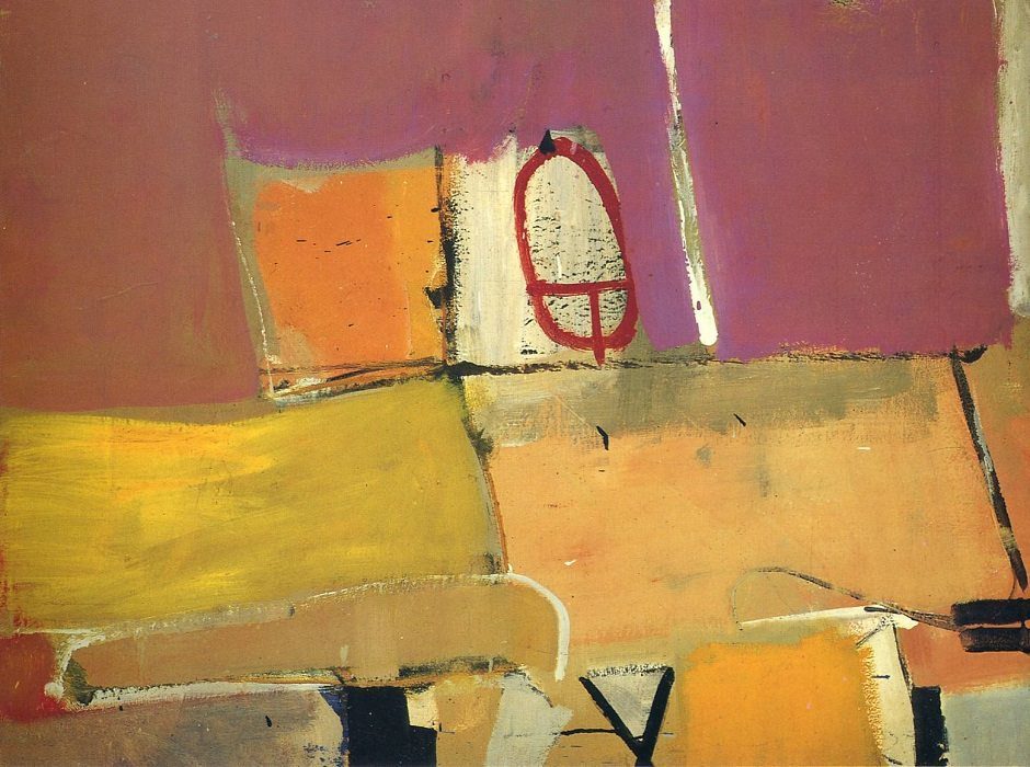
Featured Image (top of page) Albuquerque #4, 1951. Oil on canvas, 128.9 x 116.2 cm. Saint Louis Art Museum. Gift of Joseph Pulitzer Jr. (Detail)
Richard Diebenkorn : Royal Academy of Arts
Showing at The Sackler Wing of Galleries, 14 March – 7 June 2015
[button link=”https://www.royalacademy.org.uk/exhibition/richard-diebenkorn” newwindow=”yes”] Exhibition Details[/button]

Heat with our garlic. Salt to taste.